(Case study) — Branding · Logo · Fintech
Zave
Logo design & brand identity.
- Client
- Zave — fintech app
- Industry
- Investments · Mutual funds
- Scope
- Logo design & brand identity
- Deliverables
- Logo system, colour, type, cards, stationery, signage
Zave is a fintech app that lets people redeem points and invest in mutual funds seamlessly — manage investments, track a portfolio, and withdraw anytime straight to a personal account. Investing and accessing returns made simple for beginners and seasoned investors alike.
Logo concept
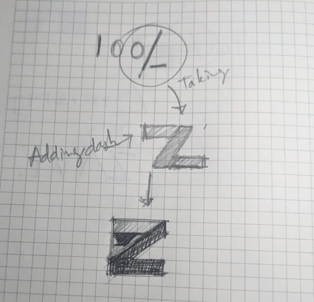
From “100%” to a Z: the slash of the percent sign became the Z, and a dash turned it into a mark of growth.
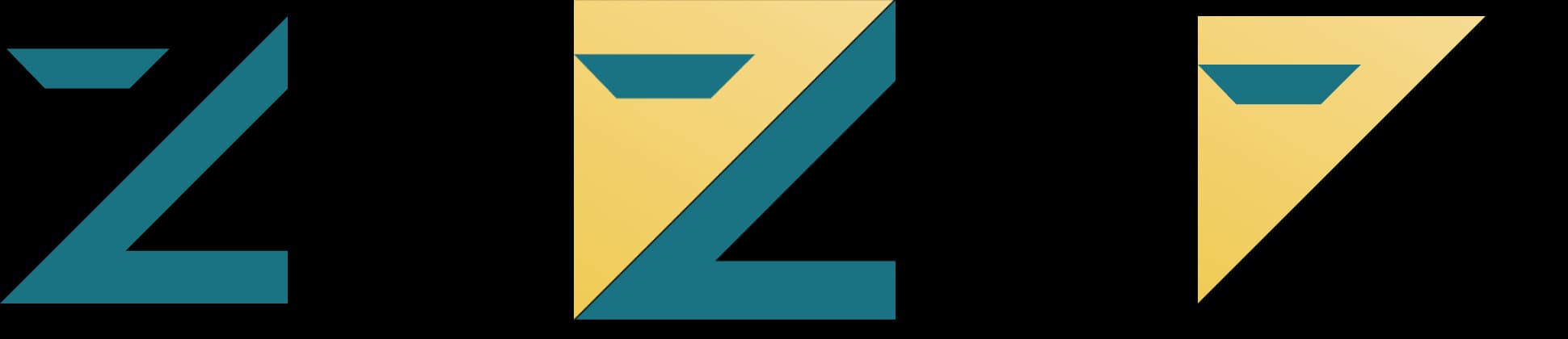
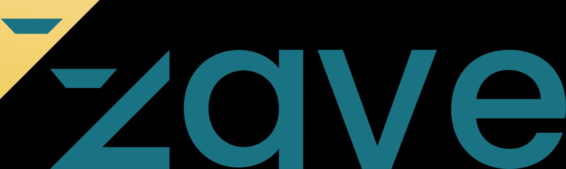
A clean sans-serif wordmark with a geometric Z. Teal evokes harmony and professionalism — ideal for fintech, where trust and clarity matter — while the gold triangle adds optimism and ambition.
Logo construction
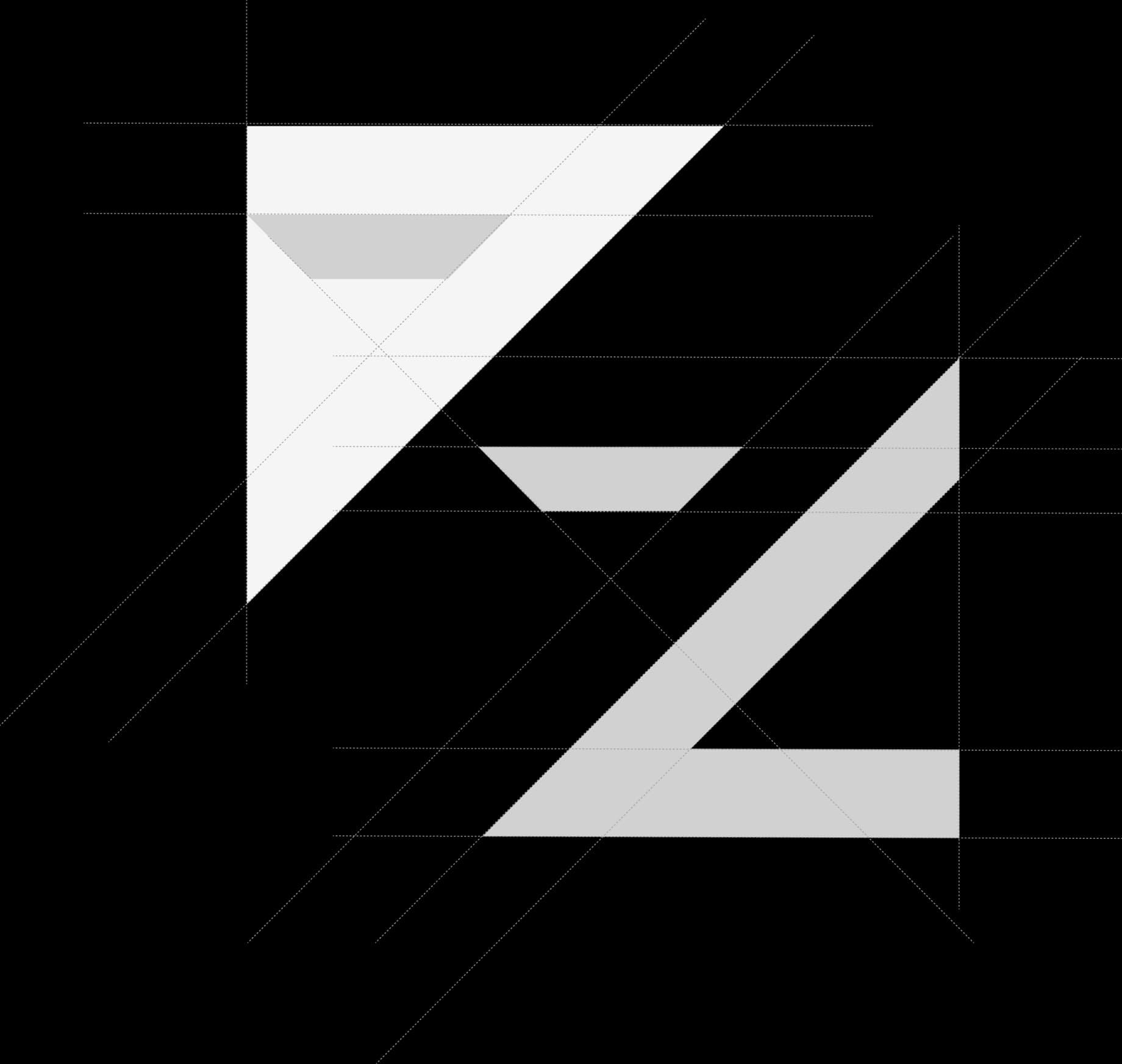
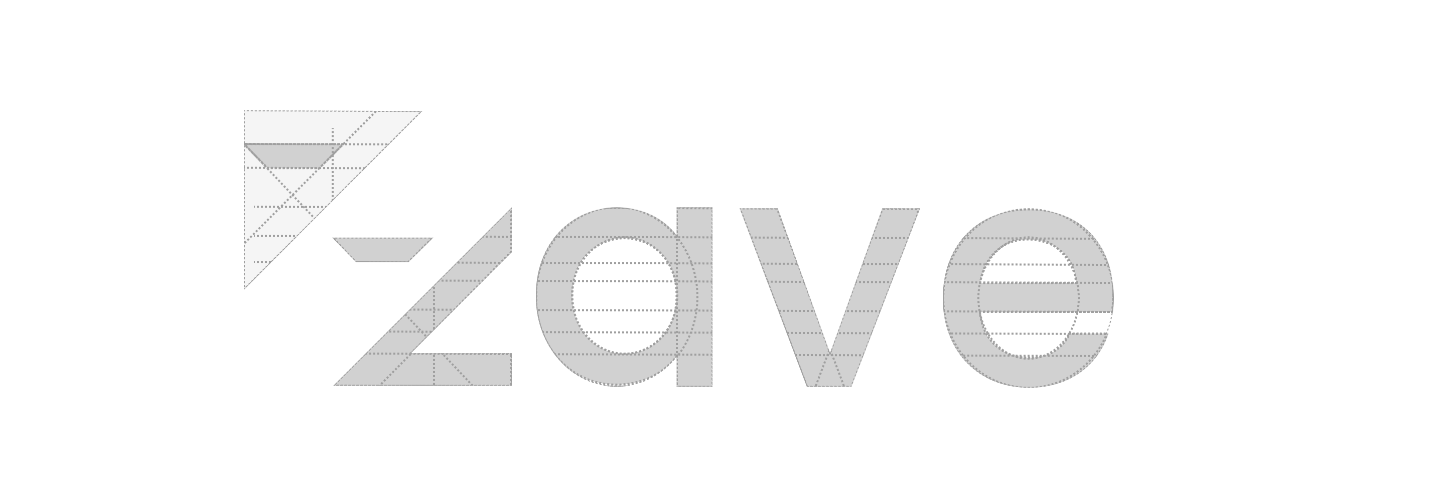
Every angle sits on a 45° grid, so the symbol and wordmark share one geometry.
Colour palette
Teal for trust, gold for optimism, white for clarity.
Sophistication, reliability and modernity — calm confidence for a fintech brand.
Optimism, warmth and positivity — success, wealth and energy that motivate.
Purity and clarity — space that lets the teal and gold breathe.
Logo variations
The mark holds up on dark, brand and light backgrounds and in single colour.
On brand teal
On black
On white
Monochrome
Typography & font
Poppins — geometric, clean and tech-savvy, balancing readability with a modern edge.
Aa
POPPINS
0123456789
abcdefghijklmnopqrstuvwxyz
ABCDEFGHIJKLMNOPQRSTUVWXYZ
Poppins follows a geometric style — letterforms built from circles, triangles and rectangles — giving a clean, symmetrical, structured look.
Its contemporary, tech-savvy feel suits fintech: a versatile, modern font that balances readability with style.
Debit card
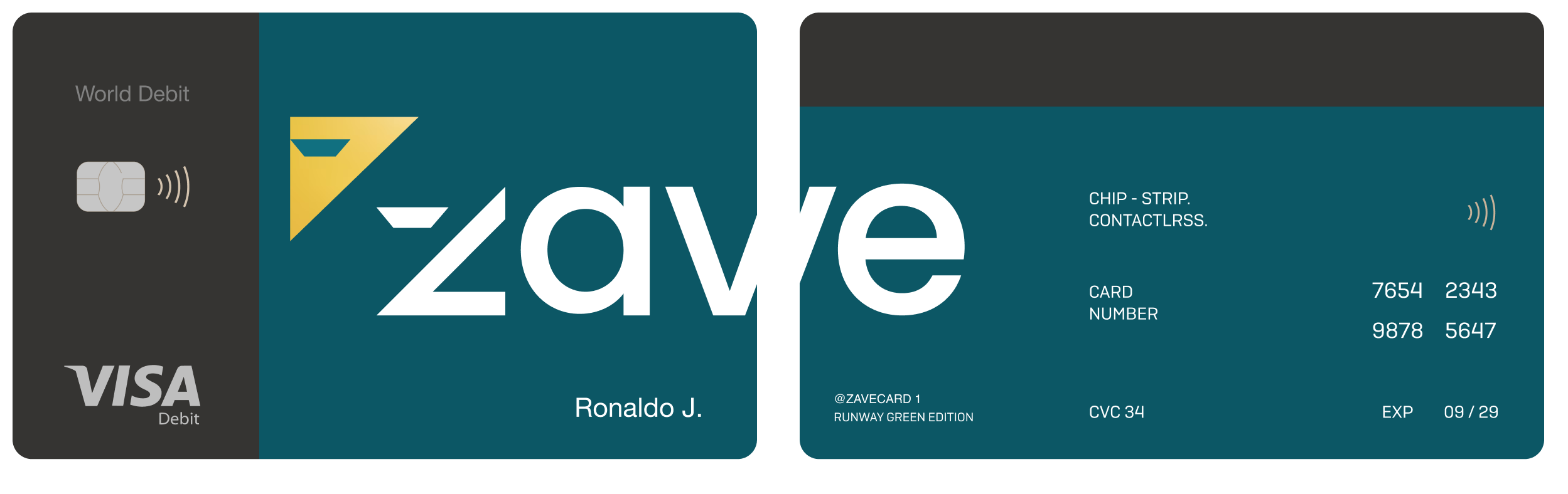
The brand carried onto a contactless Visa debit card — front and back.
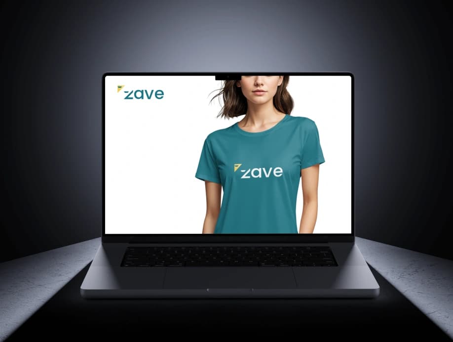
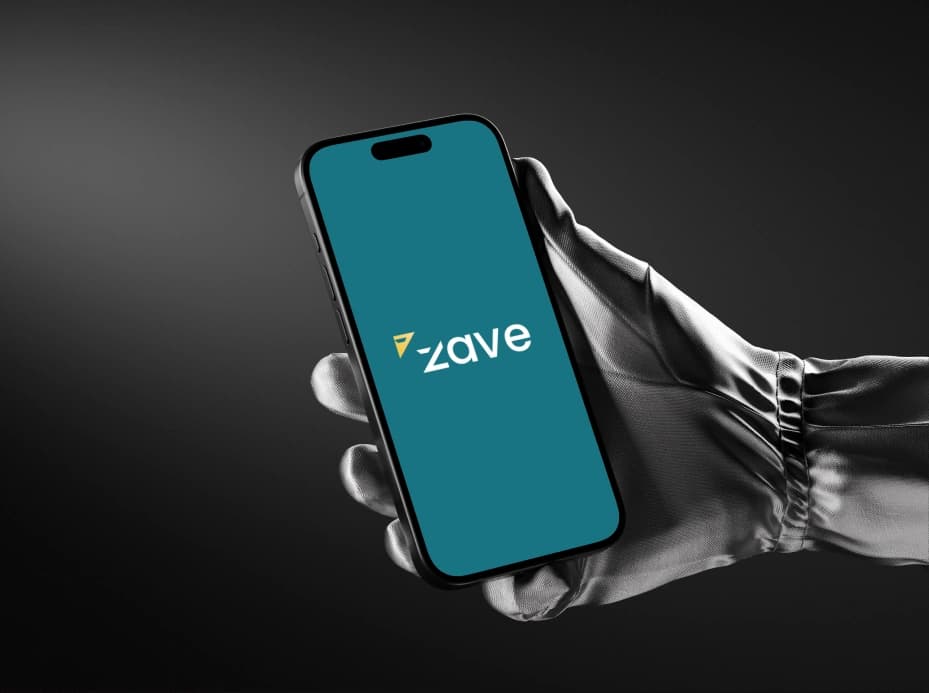
Digital presence
The identity on screen — web and the app splash.
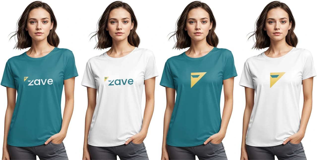
Brand apparel
Teal and white tees with the wordmark and the standalone gold mark.
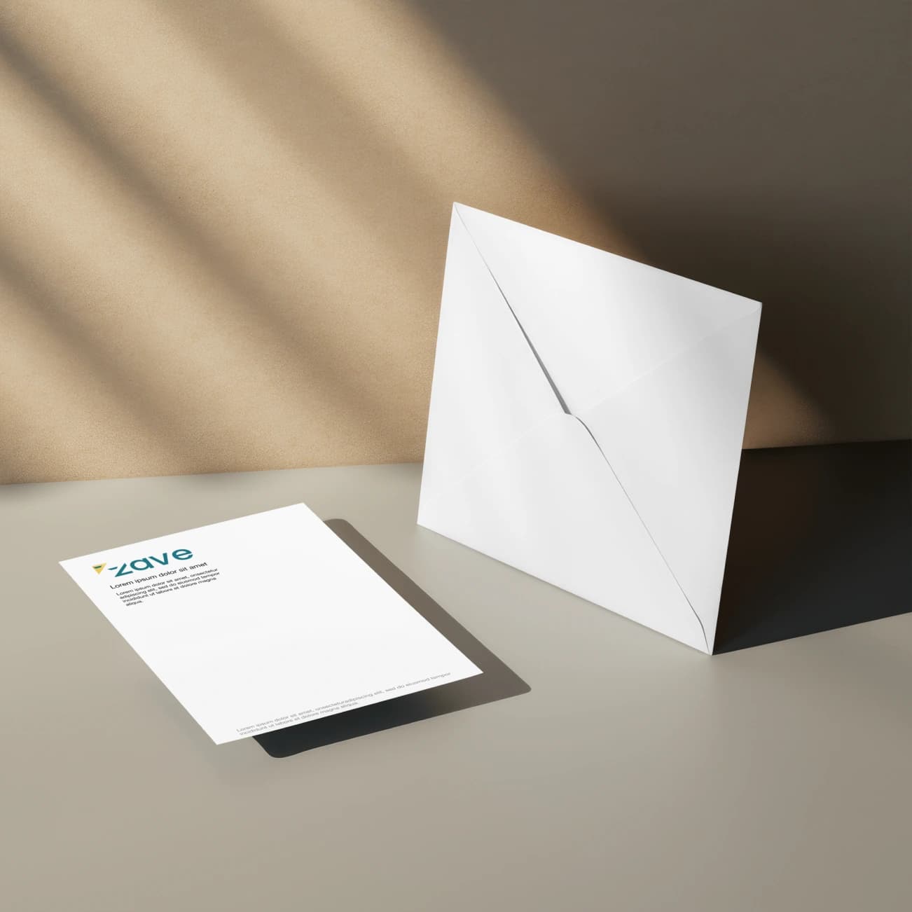
Stationery design
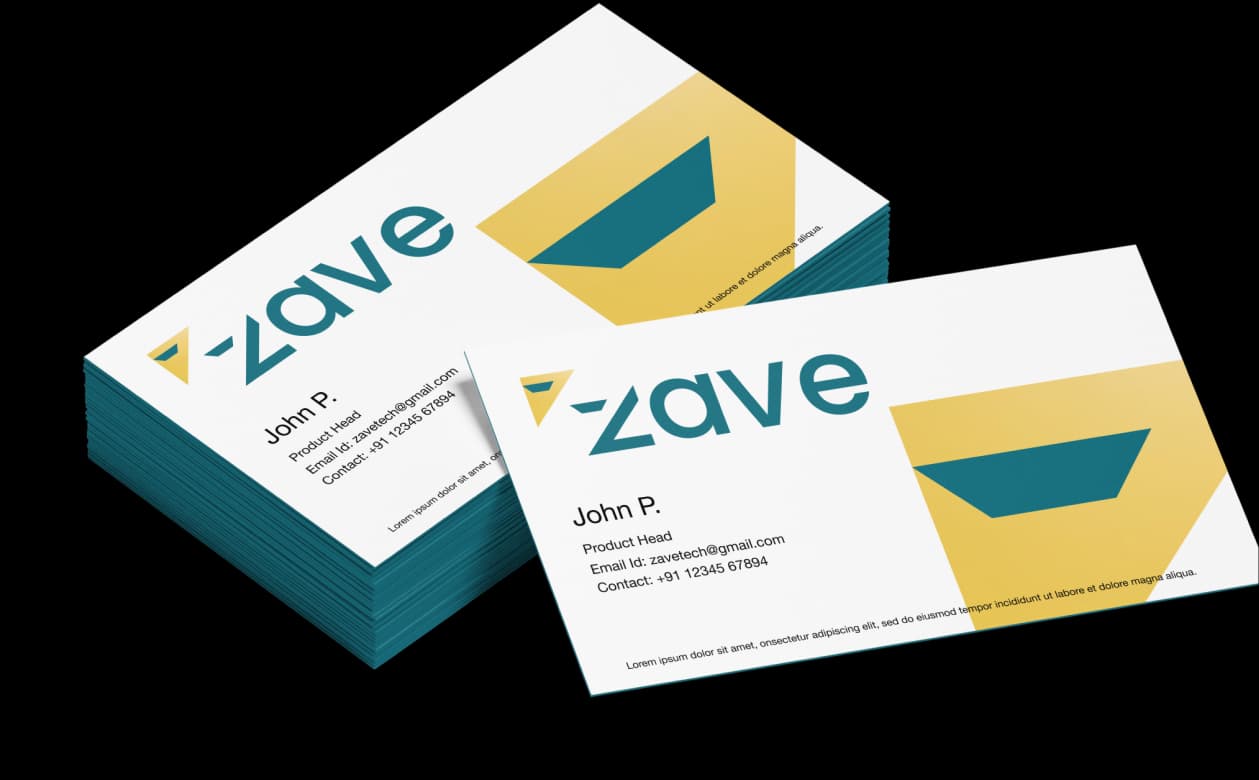
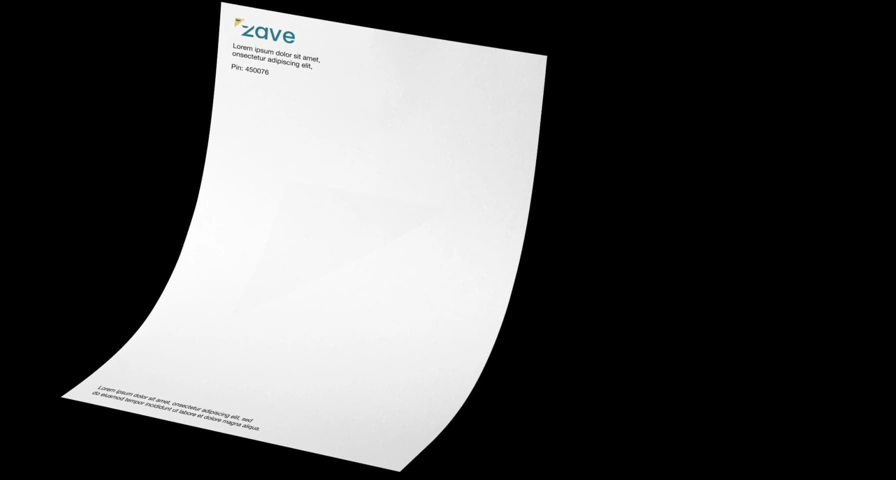
Letterhead and envelope — quiet, confident and on-brand.
Hoarding design
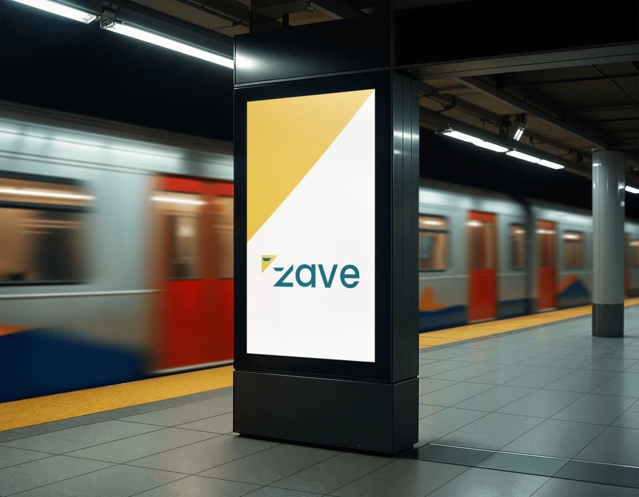
Out-of-home: a bold gold diagonal and the wordmark on a metro platform.