(Case study) — SaaS · UI/UX · Mobile app
BOOKdu
One app to read, listen and watch — for B2B and B2C readers.
A SaaS platform to learn, track and discover digital content from authors.
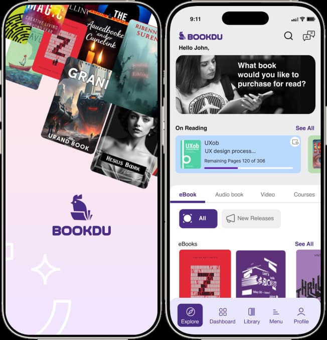
Bookdu helps readers keep track of books they’ve bought, discover new ones, and read titles their institution assigns — eBooks, audio, video and journals in one place.
- My role
- UX & interaction design, visual design, user flows, rapid prototyping
- Deliverables
- Component libraries, user interviews, high-fidelity designs
- Team
- Marketers, product managers, web & mobile developers
- Year
- 2024
The challenge
Finding the right book shouldn’t mean juggling apps for reading, audio and video.
Too many apps, no single journey
Professionals and students struggle to find the right book and end up using separate apps for reading, audio and video. They need one platform for B2B and B2C with a smooth journey.
From portal to mobile app
The client had an End-User Portal managed by a tenant admin. To reach more clients they wanted a hybrid mobile End-User App with a user-centric set of features and flows.
One app for B2B and B2C
Support books and the journals hierarchy, advanced search and several types of recommendations — in one app for both audiences.
A holistic knowledge platform
A digital platform where every type of user can connect and explore eBooks, audiobooks, video and courses — with a reader built in.
Easy-to-use, holistic knowledge platform — eBooks, an audio-video player, Reader as a Service and journals.
Design process
A five-step, user-centred process from research to tested high-fidelity screens.
- 01EmpathiseUser interviews · user research · competitive analysis
- 02DefineAffinity mapping · personas · empathy map · journey map
- 03IdeateUser flow · card sorting · information architecture
- 04DesignLow fidelity · high fidelity
- 05TestUsability testing · implementing feedback
Empathise — the product
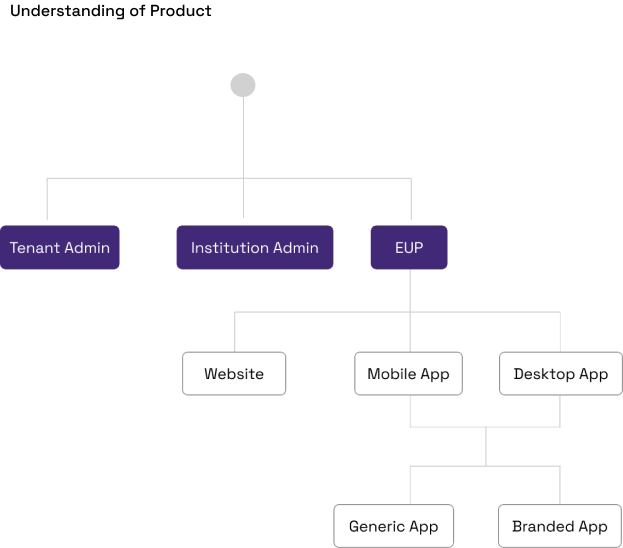
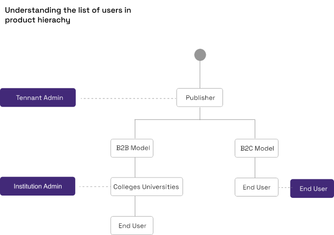
Mapping who manages, publishes and reads before designing anything.
Understanding the product
Users in the product hierarchy
Competitive analysis
A screen-by-screen review of VitalSource — what to keep and what to fix.
| Screen | Strengths | Weaknesses |
|---|---|---|
| Landing screen |
|
|
| Product detail |
|
|
| Add to cart |
|
|
| Checkout |
|
|
| History |
|
|
User interviews
A qualitative questionnaire on the challenges people face with reading apps.
Questions
- What’s your age?
- What’s your gender?
- What do you do for a living?
- Do you read books or listen to audiobooks?
- What type of books do you read?
- How often do you read or listen to a book?
- Do you prefer reading online or offline?
- How often do you buy a book or journal?
- Where do you like to buy books or journals?
- How do you feel about reading books online?
- How do you feel about current apps, features and UI?
- 18 to 64
- Both
- Students, professors, doctors, nurses, technicians, researchers
- Depends on the book
- Education, research, knowledge, novels, self-learning
- Daily, twice a week, monthly
- Mostly online; the library for offline reading
- Monthly, every six months; articles every day
- Online stores, apps, yearly publisher subscriptions
- Online books are easier to access and ready to read
- Few apps have the needed features — each format needs a different app
Survey & interview results
What readers actually value — and what they ignore.
- 01Users don’t care much about reading goals or personal stats.
- 02They care more about tracking the books they want to read.
- 03They’re interested in what friends and family are reading.
- 04New books are mostly discovered by seeing and hearing about them.
- 05Recommendations from people they trust matter most.
- 06Reviews from trusted sources beat reviews from strangers.
- 07Accurate recommendations help filter an overwhelming catalogue.
Define — personas
Two primary users: an institution reader and an independent reader.

Ohm Gupta
- Age
- 35
- Location
- Bengaluru
- Occupation
- Software engineer
- Works at
- HCL, Bengaluru
- Device
- Samsung, iPhone 13
- Most-used apps
- Instagram, Amazon
A software engineer who constantly learns new topics for work. With so many books on the market he struggles to choose, and relies on peers to recommend titles for study and research papers.
- No way to highlight key parts while reading
- No time to buy hardcover books
- Subscriptions are expensive
- Inaccurate recommendations
- Track books easily in one place
- A clear, more delightful app experience
- Highlight passages for quick access later
- Relevant recommendations

Ayush Agrawal
- Age
- 38
- Location
- Bengaluru
- Occupation
- Accountant
- Works at
- Swiggy, Bengaluru
- Device
- Samsung
- Most-used apps
- Instagram, Swiggy, Amazon
An account manager who keeps exploring new topics in his field, reads a lot and applies what he learns to his research.
- No features to recall past readings
- No time to buy hardcover books
- Books are expensive
- Hard to identify the right book
- Track books easily in one place
- A clear, more delightful app experience
- Highlight passages for quick access later
- Relevant recommendations
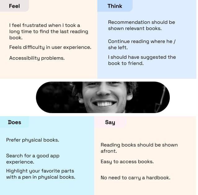
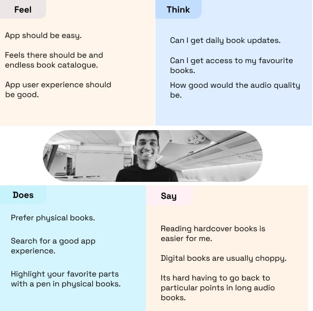
Empathy maps
What each persona says, thinks, does and feels.
Journey map
Most readers have gone digital and want an app with a great reading experience and a smooth exit.
| Sign up / Sign in | Home | Product details | Reading experience | |
|---|---|---|---|---|
| Doing | B2B users sign in with an institute ID; B2C users sign up with personal email. | B2B: only assigned books. B2C: a huge rack to choose from. | B2B: assigned books can be downloaded. B2C: can purchase. | The reader tool helps both users read. |
| Touch points | Bookshelf, Inkitt | Bookshelf, R Discovery, Inkitt | Bookshelf, R Discovery, Inkitt | Bookshelf, R Discovery, Inkitt |
| Thinking | Should be easy and smooth — invest more in sign-up. | Only a few books shown; finding the right one should be faster. | Pages feel thin; should allow reading the synopsis. | Should tag readings and offer a highlighter. |
| Feeling | Boring sign-up process. | Screens lack UX; actions unclear; accessibility issues. | Weak branding; too many unhelpful features. | Wants colour correction and a choice of fonts. |
| Opportunities | Capture user interests during sign-up. | Categories, filters, advanced search, recommendations, promotions. | List maximum details on the details page. | Take inspiration from the Kindle reader. |
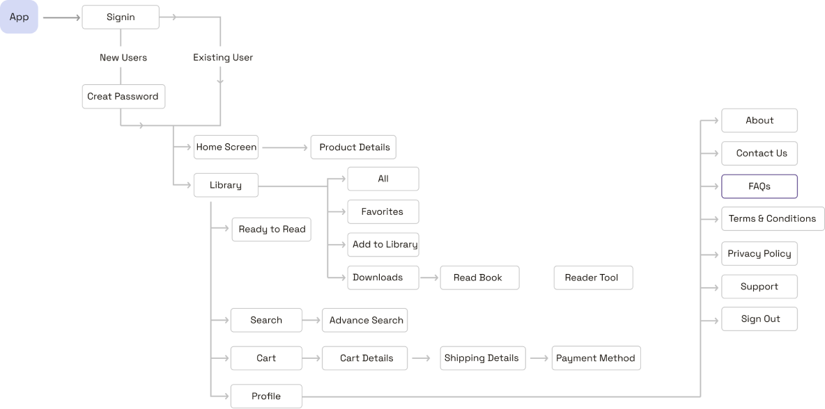
Site map
Information architecture for sign-in, home, library, search, cart and profile.
User flows
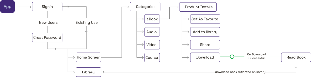
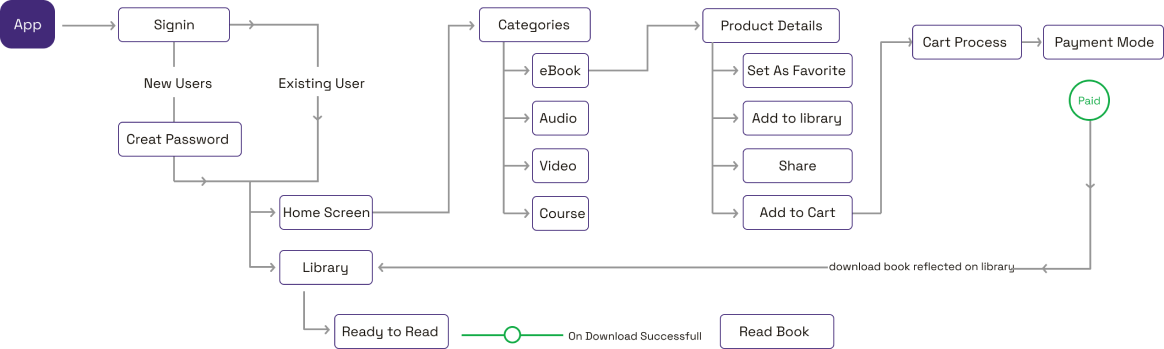
How B2B and B2C readers move from sign-in to reading.
User flow — B2B
User flow — B2C
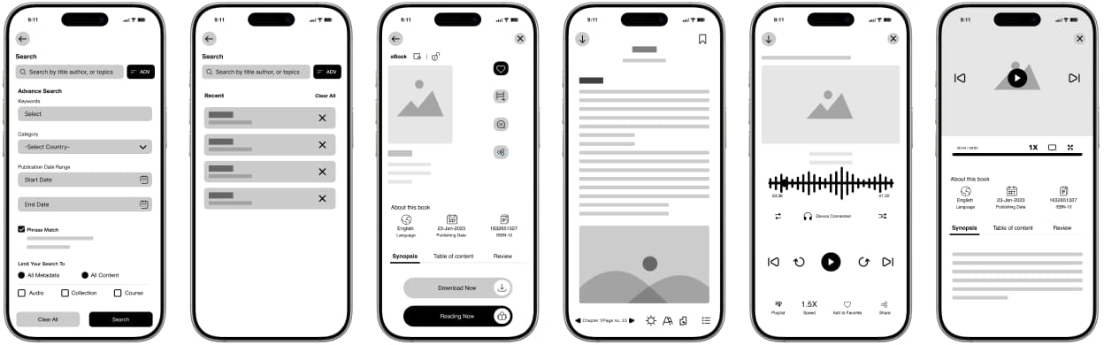
Mid-fidelity wireframes
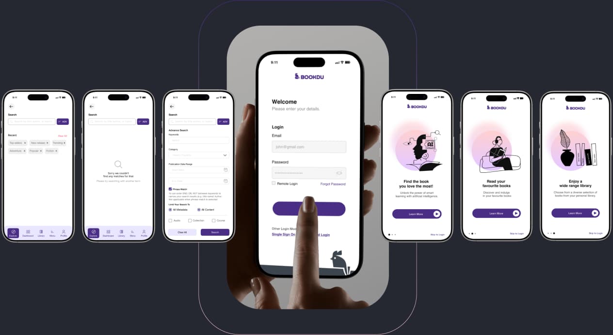
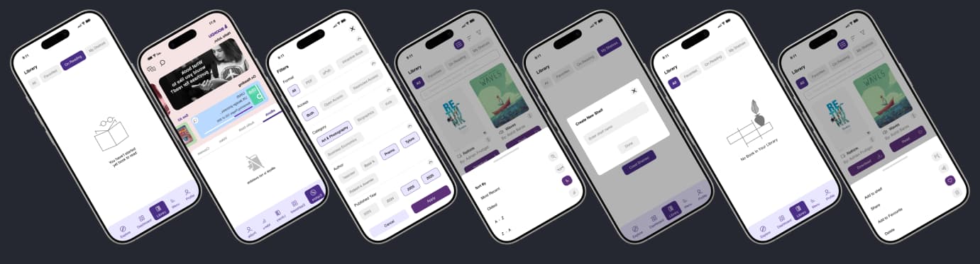
Onboarding, login, library, dashboard, search, details and the reader — tested before visual design.
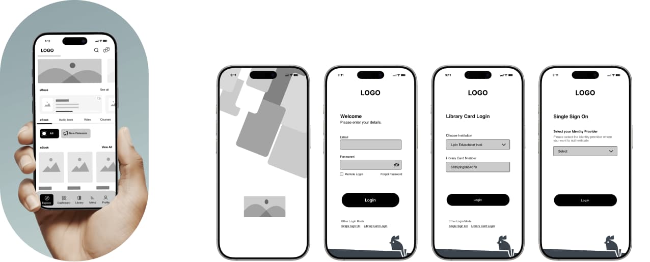
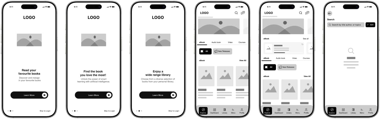
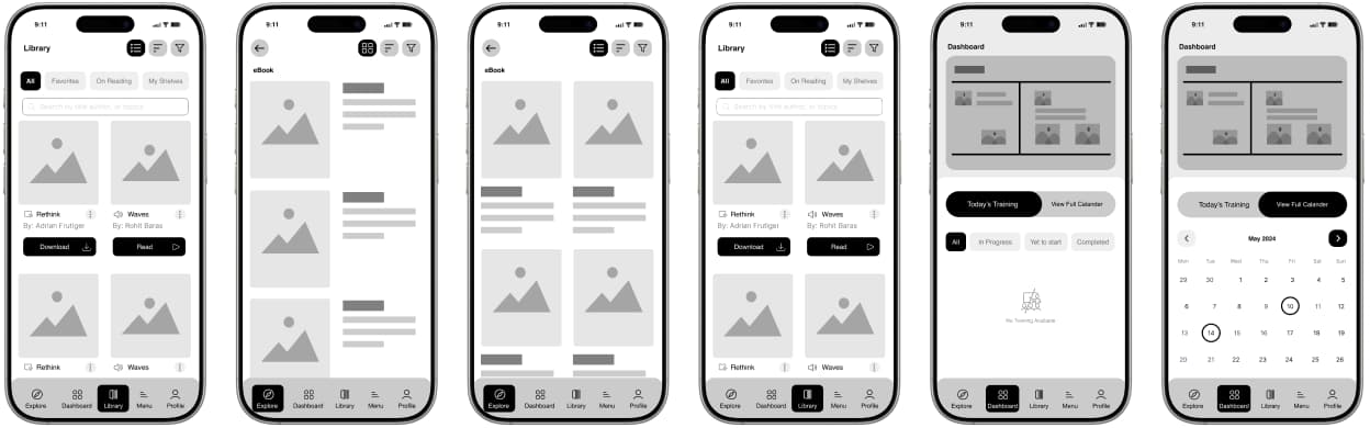
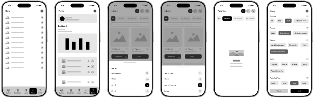
Visual design
Aligning aesthetics with function for a calm, consistent reading experience.

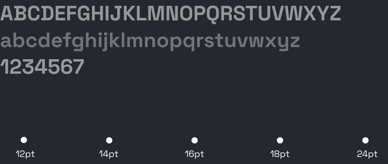
Deep purple drives CTAs and icons, a deep greyish-blue replaces pure black for text, and light lavender and grey keep surfaces soft. Tertiary tints add depth and smoother transitions.
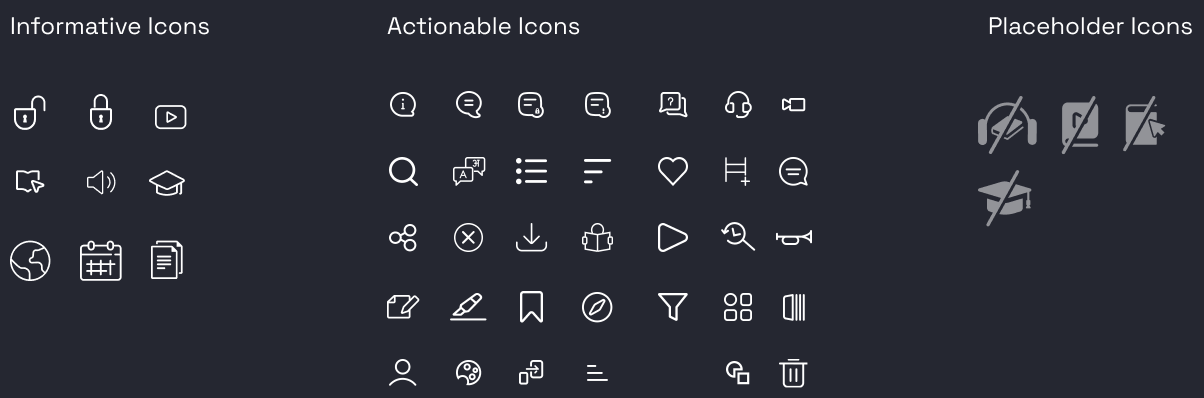
Icons & illustration
Informative, actionable and placeholder icons, plus monochrome spot illustrations.

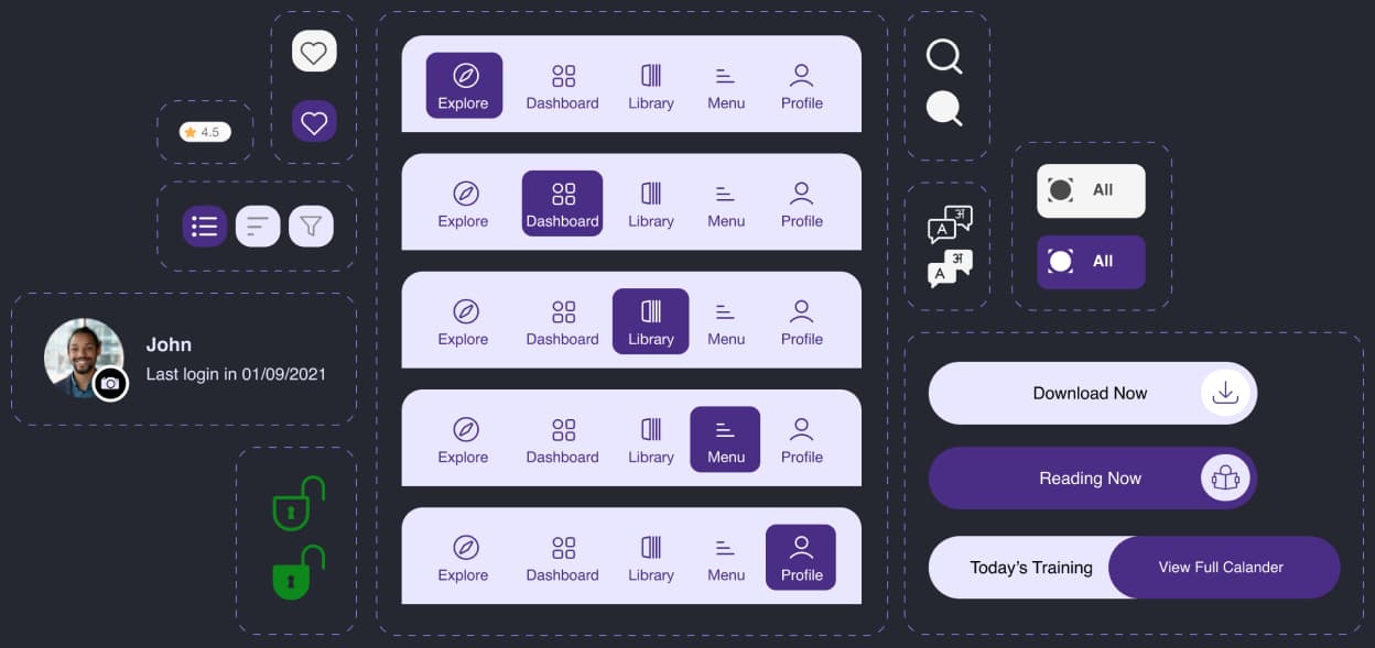
Design system
Reusable navigation, buttons, toggles and profile components.
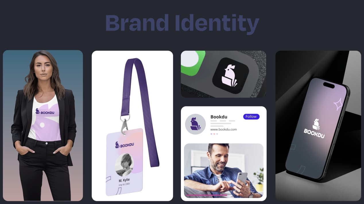
Brand identity
The Bookdu mark across apparel, ID cards, app icon and social.
Final screens
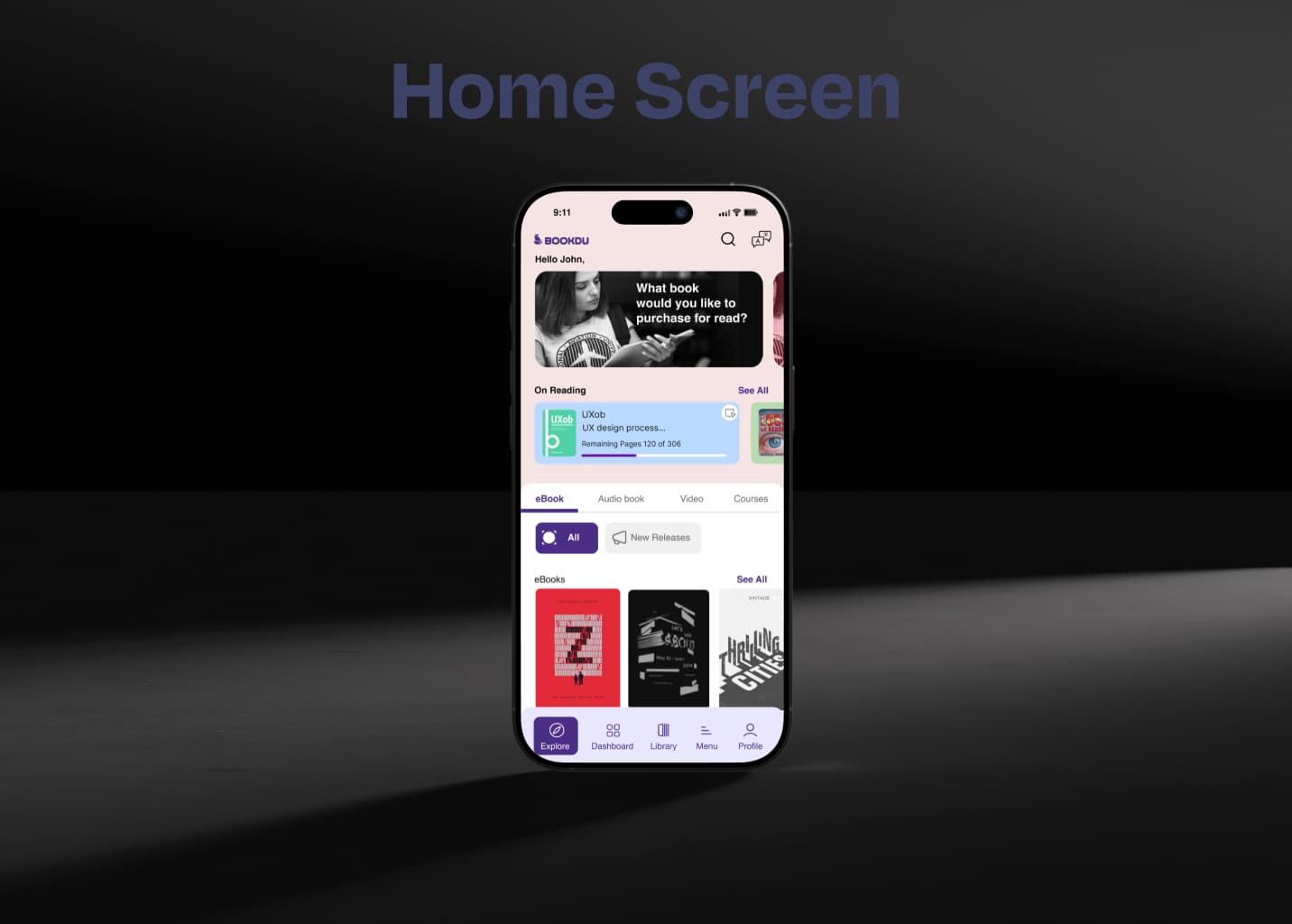
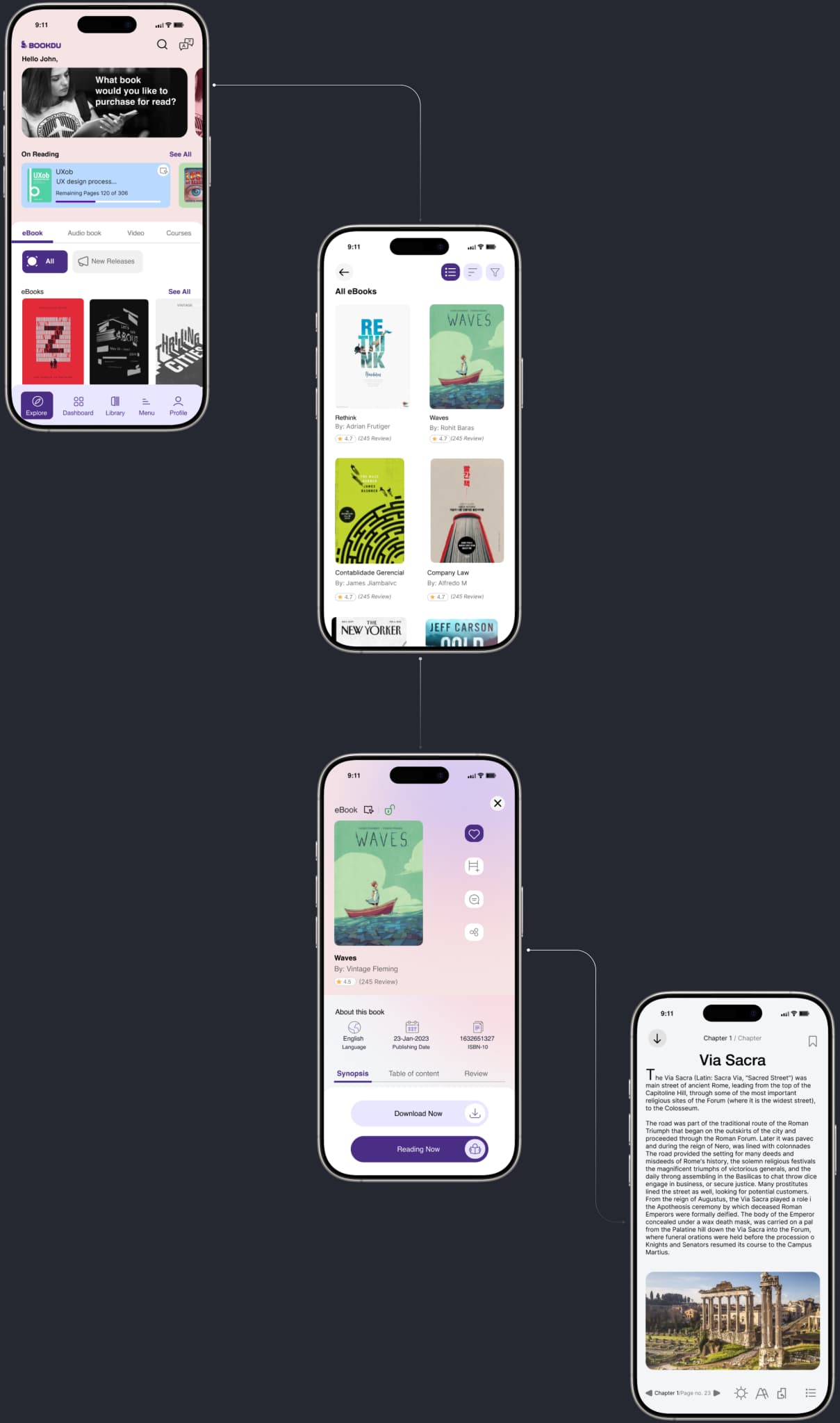
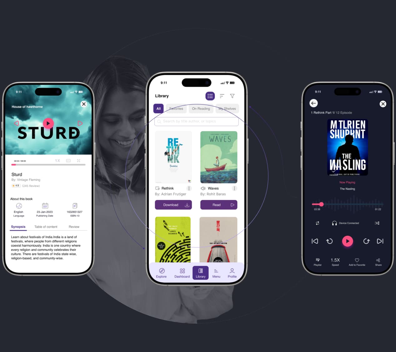
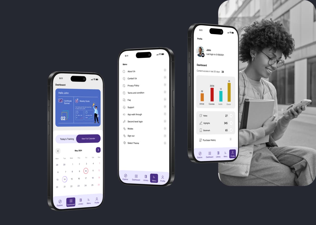
Home, browsing, details, reader, library, audio, dashboard, menu, profile and login.