(Case study) — Rebrand · Graphic design · Print
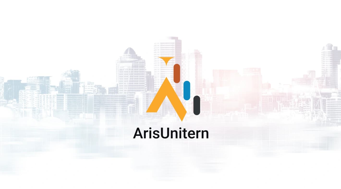
ArisUnitern
Building India’s largest infratech platform.
- Client
- Arisinfra · ArisUnitern
- Role
- Graphic designer
- Scope
- Logo, stationery, print, motion
- Industry
- Construction · Infratech
Simplifying construction.
As graphic designer I helped rebrand Arisinfra — a company simplifying construction through the sale of building materials and machinery. The work covered a refreshed identity: a new logo, complete stationery, print collateral, motion graphics and animation.
Brand colours
Amber for energy and construction, rust and ocean blue for the rising bars, charcoal for grounding.
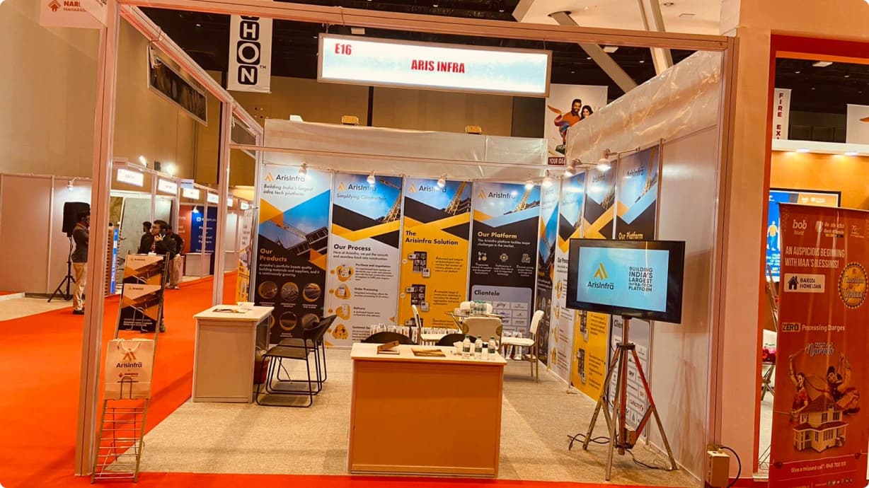
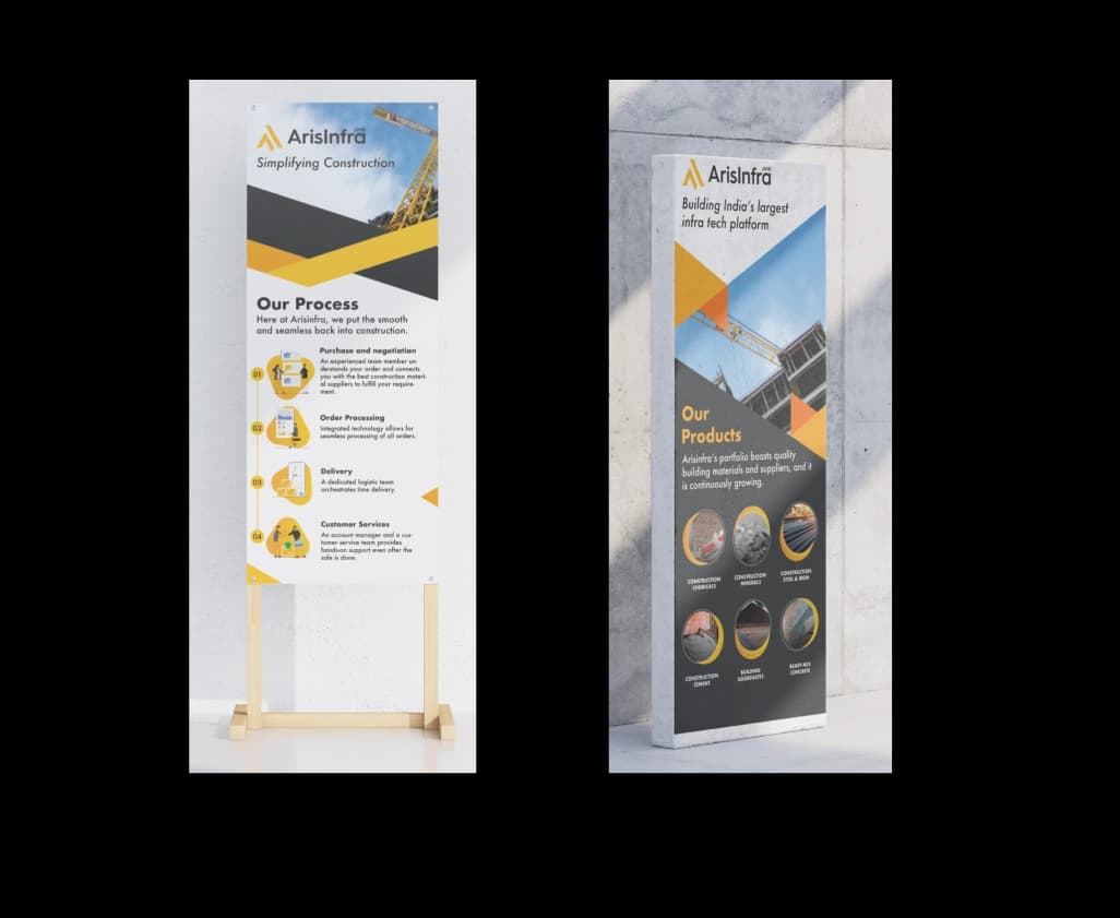
Exhibition booth
Stall E16 at the NAREDCO Hamethon property expo — standees, signage and screen loops.
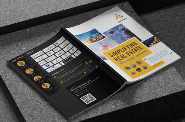
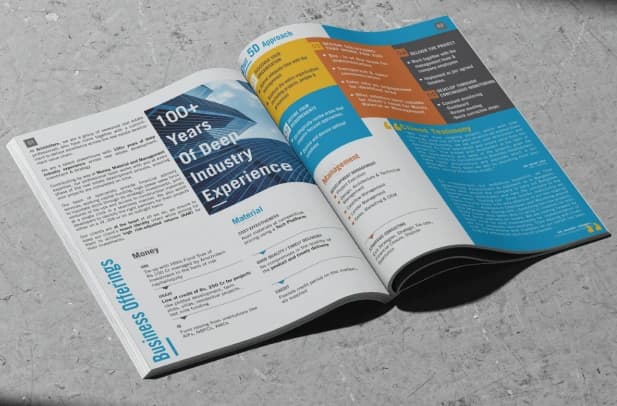
Brochure design
A bold amber-and-charcoal brochure: “Simplifying real estate” — money, material, management.
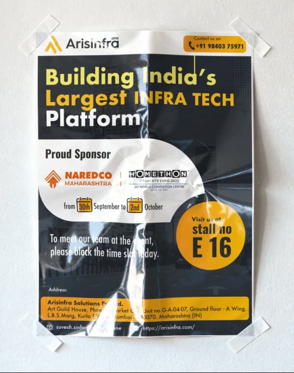
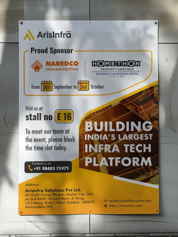
Event posters
Proud-sponsor posters announcing the expo, the stall and how to reach the team.
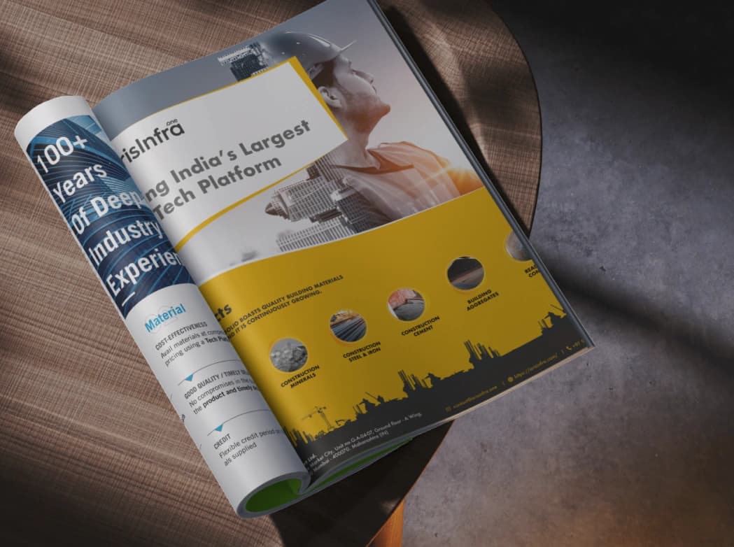
Magazine ad
A full-page spread for “100+ years of deep industry experience”.
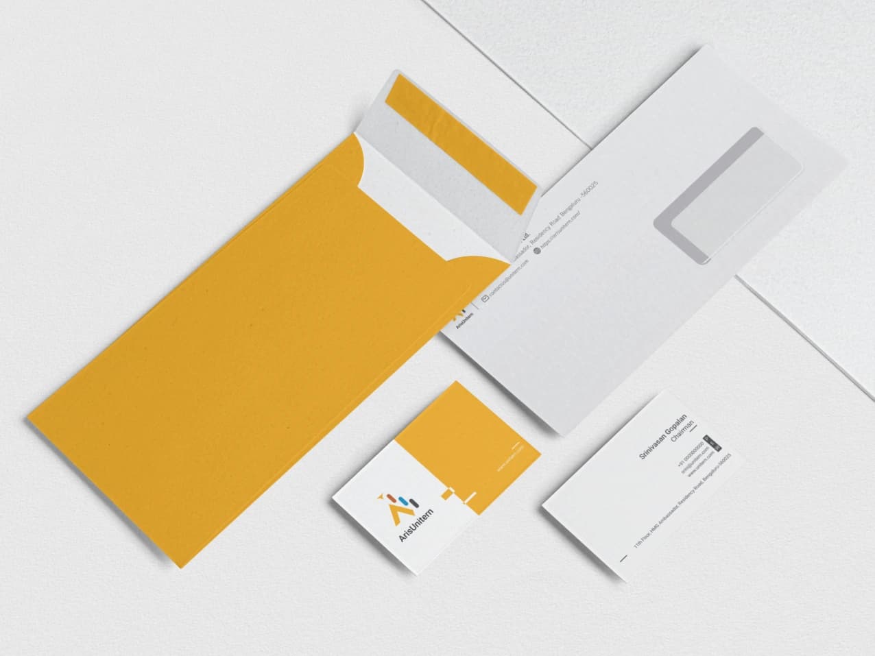
Stationery system
Envelopes and business cards built on the amber block and the rising-bar mark.
Brand merchandise
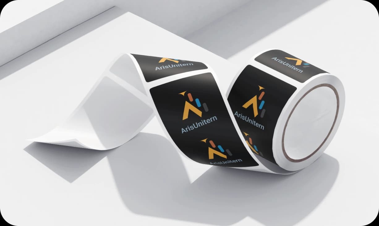
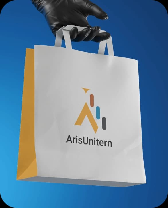
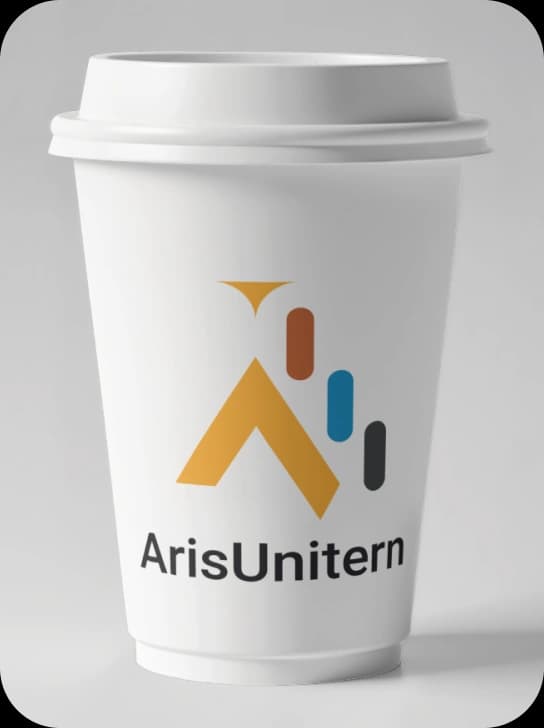
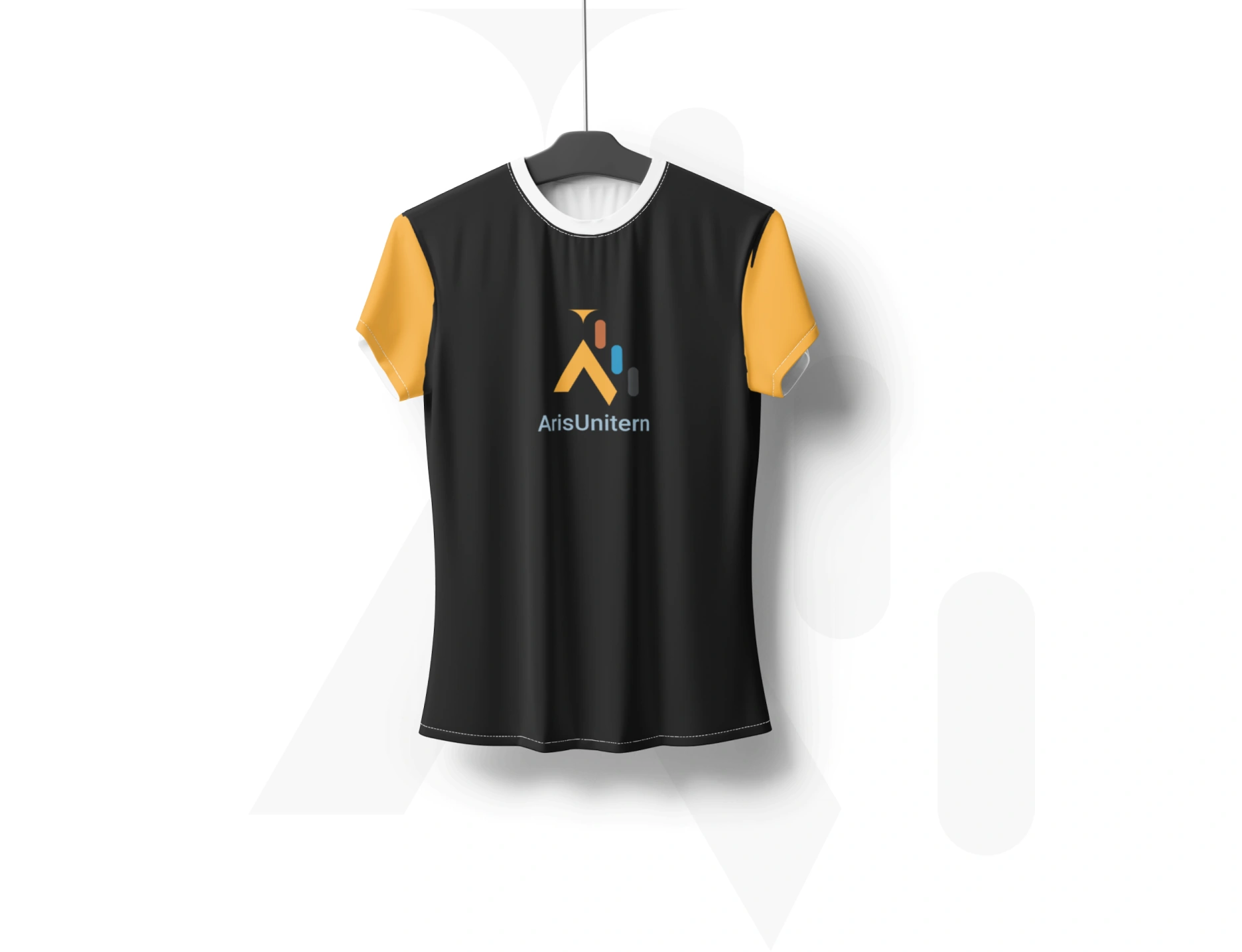
The mark on everyday touchpoints — tape, carry bags, cups and team tees.